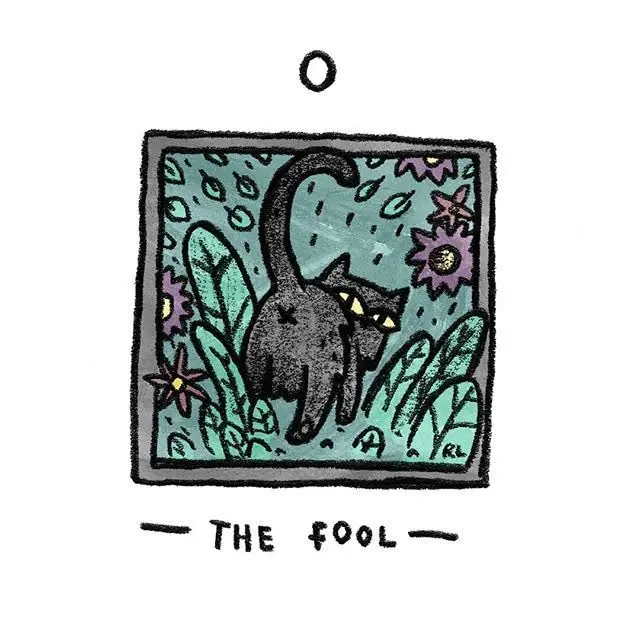
New Palladini Tarot Card Gallery
Browse 74 verified New Palladini Tarot card-front images recovered from the original TarotFans source board. This honest partial gallery uses neutral source-order labels until every card can be safely named. Tap any card to open a larger carousel view.
The New Palladini Tarot is a bright, polished tarot deck by David Palladini, the artist many readers know from the classic Aquarian Tarot. This review focuses on the deck as it actually feels in the hand and on the page: theatrical, clean-lined, jewel-toned, and easy to read without looking plain. TarotFans currently has a verified 74-card source gallery for this review, so the page keeps the count honest instead of claiming a complete 78-card view before every missing card has been recovered.
If you like Rider-Waite-Smith structure but want something sleeker than the traditional Pamela Colman Smith artwork, this is the kind of deck that can make familiar meanings feel fresh again. The figures are elongated, the colors are dramatic, and many scenes have a stained-glass or storybook quality. It is not a soft watercolor deck, and it is not a minimalist modern deck. It sits in a stylish middle space: readable enough for learning, decorative enough for collectors, and expressive enough for serious daily readings.
New Palladini Tarot at a glance
Best for: readers who want classic tarot meanings with a cleaner fantasy-art look. The deck works well for personal readings, client readings, journaling, and study sessions where you want the image to speak quickly.
Style: Art Nouveau curves, bold black linework, jewel colors, fantasy costumes, dramatic skies, and symbolic scenes that still feel connected to traditional tarot.
Gallery note: the native TarotFans gallery on this page shows 74 verified same-deck card-front images recovered from the original source board. A few cards are still missing from the recovered set, so the review uses honest partial-gallery wording.
Study 1: why the deck reads so clearly

The strongest thing about The New Palladini Tarot is how quickly the shapes communicate. Even before you know every symbol, the figures, gestures, color blocks, and borders guide your eye toward the emotional point of the card. That makes the deck friendly for newer readers who are still building confidence.
The artwork does not feel crowded. Palladini gives each scene a strong silhouette, then adds detail in the clothing, sky, faces, and small symbols. In a reading, that means you can start with the big mood first, then move into the smaller clues when you need more nuance.
Artwork and first impression
The first impression is color. The deck loves deep blacks, hot reds, bright greens, pale faces, and gold accents. Many cards look like little stage sets, with a figure placed in the center and the background arranged almost like a curtain or painted backdrop. That theatrical feeling is part of the charm. It makes a simple one-card pull feel special without making the meaning hard to find.
Compared with older RWS-style decks, The New Palladini Tarot feels more polished and more graphic. The lines are crisp. The faces are serene but slightly mysterious. The outfits have a medieval-fantasy flavor, and the skies often make the scene feel enchanted. If you want earthy realism, this may not be your perfect match. If you want a deck that looks elegant, symbolic, and a little dramatic, it has a lot of personality.
Four-card moment
Look for the main gesture first


Before reading the tiny symbols, notice posture, direction, light, and color. This deck often gives you the emotional answer through the main pose.
How The New Palladini Tarot reads
In readings, this deck feels direct but not harsh. It has enough traditional structure to support classic tarot spreads, but the art softens some of the rougher moments with beauty and distance. Difficult cards still feel meaningful, yet they do not shout. That can be helpful for client readings or sensitive questions, where you want honest guidance without making the whole session feel heavy.
The deck is especially good for questions about choices, creative direction, relationships, timing, and personal growth. The scenes feel symbolic rather than literal, so they invite interpretation. A reader can talk about mood, movement, clothing, gaze, and color while still staying grounded in the tarot system. That balance is why many people keep Palladini decks around even after they own many newer tarot releases.
Study 2: the jewel-tone mood

The jewel-tone palette matters because it makes the deck feel alive on the table. Reds, greens, blues, and golds separate emotional zones quickly. If a spread contains several cards with similar color temperature, you can often see the shared theme before reading the titles.
That visual rhythm is useful for teens and new readers too. Instead of memorizing every keyword at once, they can ask simple questions: Where is the light? Who is moving? Which card feels tense? Which card feels open? The New Palladini Tarot rewards that kind of visual reading.
Who will enjoy this deck?
You may love The New Palladini Tarot if you want a traditional-reading deck with a sleek fantasy style. It is a strong choice for people who like Art Nouveau lines, stylized faces, symbolic scenes, and a deck that feels collectible without becoming confusing. It can work as a first “non-classic” tarot deck because the meanings stay close enough to the familiar system.
You may want a different deck if you need photographic realism, very modern everyday scenes, or a fully inclusive contemporary cast. The New Palladini Tarot has a distinct vintage-fantasy personality. That personality is beautiful, but it is not neutral. The best way to decide is to browse the gallery and notice whether the artwork makes you want to keep looking.
Four-card moment
Color as a reading clue


Try reading these as a color story first: what feels warm, cool, tense, calm, crowded, or open? Then layer the traditional meaning back in.
Pros and cons
| Pros | Cons |
|---|---|
| Elegant fantasy artwork that still supports classic tarot meanings. | The style may feel too theatrical if you prefer everyday modern scenes. |
| Clear linework and strong poses make many cards quick to read. | The current TarotFans gallery is partial, with 74 verified card fronts rather than all 78. |
| Good bridge deck for readers moving beyond the classic RWS look. | Some readers may want more diversity and contemporary imagery. |
Study 3: best spreads to try

This deck shines in small spreads. Try a three-card line for “what is clear, what is hidden, what moves next,” or a four-card creative spread for “idea, obstacle, support, outcome.” Because the images are so graphic, you do not need a large spread to get a strong impression.
For beginners, I would start with one-card daily pulls and ask: what is the figure doing, what color dominates, and where does my eye land first? Those three questions turn the art into a practical reading tool.
Four-card moment
A simple reading path


Read left to right as mood, challenge, help, and next step. The deck’s clean silhouettes make this kind of quick spread easy to follow.
Final thoughts
The New Palladini Tarot is a stylish bridge between traditional tarot structure and polished fantasy illustration. It keeps enough of the classic system to be useful for study, but it has its own visual world: dramatic, elegant, jewel-colored, and a little mysterious. I would recommend it to readers who want a deck that is easy to read but still feels special every time it comes out of the box.
The honest 74-card gallery below the video gives you a strong look at the deck’s visual language. Browse the cards slowly, notice whether the faces and colors pull you in, and then decide if this is the version of classic tarot you want on your table.

Frequently Asked Questions
Is The New Palladini Tarot good for beginners?
Yes. It stays close enough to traditional tarot structure that beginners can learn with it, while the clean linework and strong poses make the images easy to read.
Does this page show all 78 New Palladini Tarot cards?
No. The current TarotFans native gallery shows 74 verified card-front images. The page keeps that partial count honest instead of claiming a complete 78-card gallery.
What is the art style of The New Palladini Tarot?
It has a polished fantasy style with Art Nouveau influence, jewel colors, strong outlines, dramatic skies, and elegant figures.
Does The New Palladini Tarot follow Rider-Waite-Smith meanings?
Mostly, yes. It is friendly to traditional tarot reading, though David Palladini’s artwork gives the scenes a more stylized and theatrical mood.
What readings is this deck best for?
It works well for choice readings, creative planning, emotional check-ins, daily pulls, and small spreads where you want strong visual cues.
Who might not enjoy The New Palladini Tarot?
Readers who prefer photographic realism, very modern everyday scenes, or soft watercolor art may prefer a different deck. This one has a clear vintage-fantasy personality.