Klimt Tarot Card Gallery
Browse the clearly verified card fronts in deck order. Select any card to open its full-size view; uncertain and unusably small source records are omitted rather than enlarged or guessed.
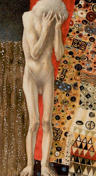
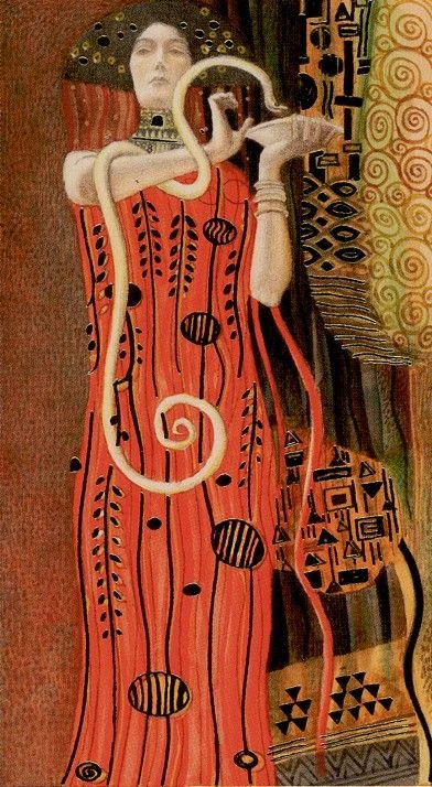
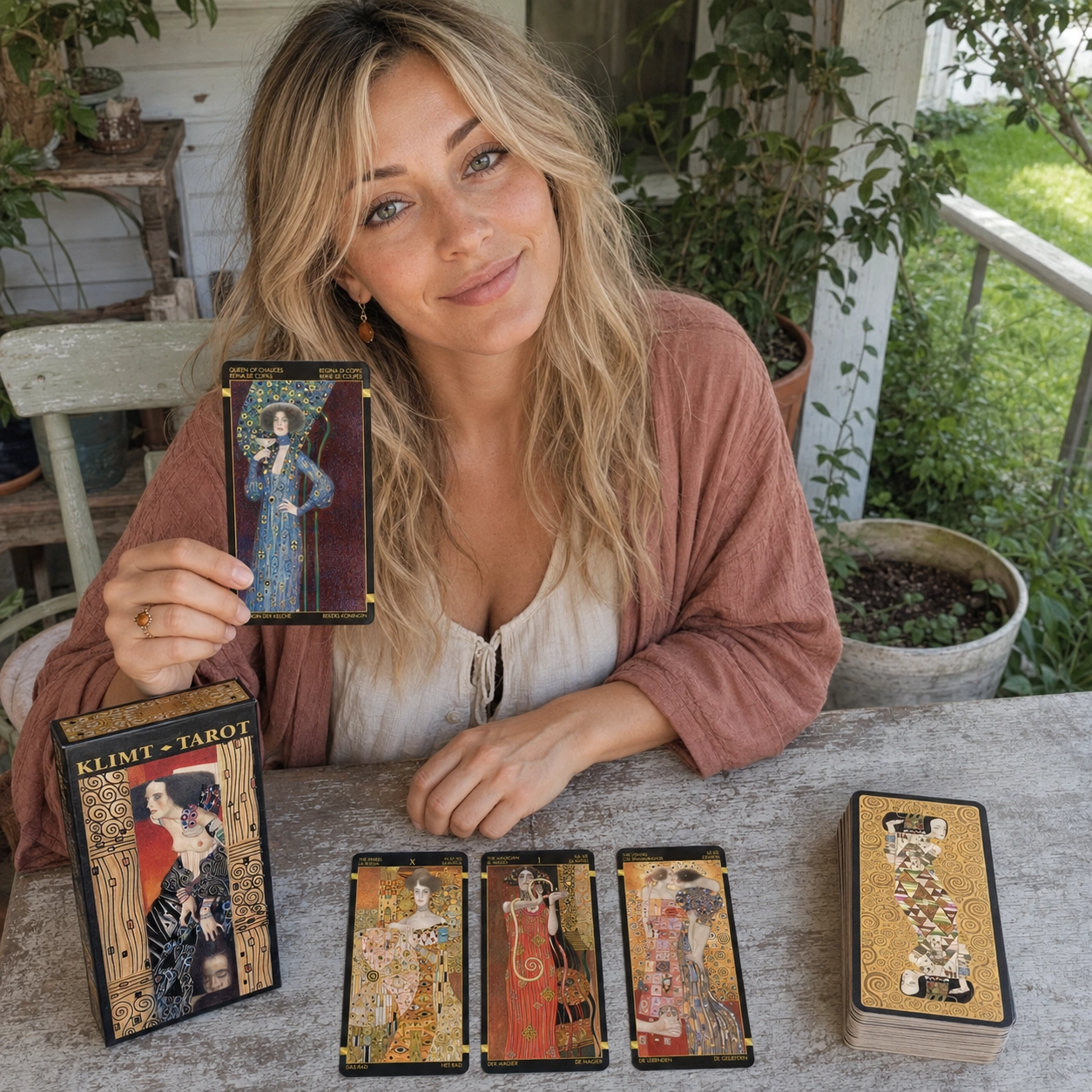
Aurica’s Quick Take
Klimt Tarot, illustrated by A. A. Atanassov and published by Lo Scarabeo, turns the familiar tarot structure into a gold-framed theatre of desire, elegance and psychological tension. The cards echo Gustav Klimt’s flattened figures, patterned fabrics and mosaic surfaces without behaving like a simple museum reproduction deck.
My quick verdict: this is a memorable art deck that reads best when you let posture, distance, texture and colour speak before reaching for a keyword. It is especially persuasive for questions about attraction, creative identity, power, status and the cost of wanting something beautiful.
I begin with the place where the gold seems to catch, then notice what the figure is doing beneath all that splendour. A turned shoulder can feel guarded, a lifted chin can turn longing into resolve, and an empty space between two bodies can speak more clearly than ornament. I test that first feeling against the card’s traditional role and the neighbouring cards, so beauty becomes a doorway into the reading rather than a distraction from it.
The Queen of Chalices reminds me that sensitivity is not softness without shape; it is the courage to hold emotion carefully and still look it in the face. With The Wheel, The Magician and The Lovers nearby, she asks what desire is creating, what chance is changing, and what choice can be made with an open heart. May this luminous deck help you see your own story more honestly—and choose the next beautiful step with confidence.
Klimt Tarot review — beauty with a sharper edge
What makes Klimt Tarot different?
Atanassov builds scenes from pale figures, dark grounds, geometric panels and dense gold ornament. Bodies often feel exposed while clothing and borders become elaborate visual armour. That contrast gives the deck its distinctive voice: intimacy and display are rarely separate.
The underlying system remains recognizable—Major Arcana, Wands, Cups, Swords and Pentacles—but it is not a scene-for-scene Rider–Waite–Smith clone. Justice appears before the Hermit and Strength follows the Wheel, preserving the older Continental numbering rather than the RWS Strength VIII and Justice XI arrangement. Treat the title as the structural anchor and the artwork as the emotional evidence.
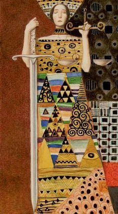
Justice: clarity held between blade and balance
A frontal crowned figure holds an upright sword on one side and a small set of scales on the other. Her robe is divided into bands of triangles, spirals, eyes and black-and-white blocks; the strict vertical pose is surrounded by asymmetrical fields of red, black, gold and white.
In a reading, the straight sword and measured scales favour a decision that can be explained, not merely felt. The patterned robe suggests that every verdict contains many pieces of evidence. Upright, this can be disciplined fairness and clean boundaries; in shadow, certainty can harden into judgment. Ask which fact restores proportion.
How Klimt Tarot reads in practice
This deck reads through relationships inside the frame: who approaches, who withdraws, where a figure looks, and whether ornament protects or overwhelms them. Gold can suggest value and radiance, but it can also feel like display, expectation or a beautiful enclosure.
For a clear three-card reading, try what attracts me / what complicates it / what has lasting value. Describe each image in plain language first, then add the traditional meaning. That order keeps the deck from becoming decorative wallpaper.
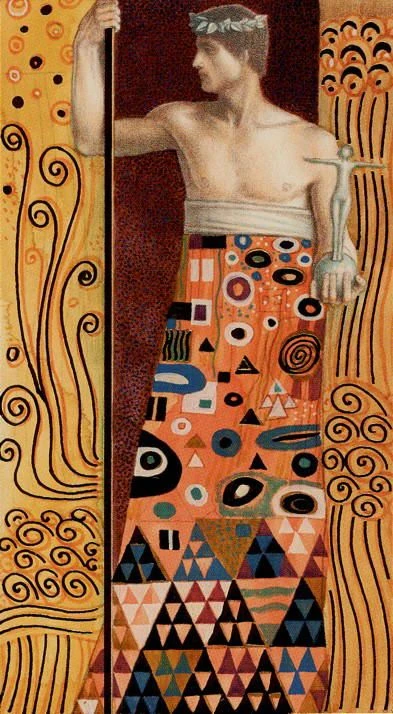
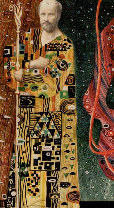
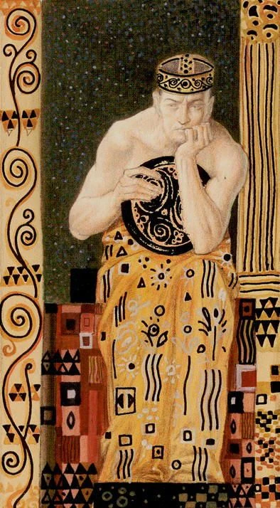
Four faces of visible authority
The Emperor, Hierophant, Queen of Wands and King of Pentacles all place human authority inside strong decorative structures. Each card asks whether influence comes from position, knowledge, presence or material command.

Is Klimt Tarot beginner-friendly?
A committed beginner can use it, especially with a separate meanings guide, but it is not the most literal first deck. Its strongest cues are often atmosphere, gesture and pattern. If you already know the basic structure, those departures become an advantage rather than an obstacle.
Easy reading
What deserves my attention and appreciation today?
Medium reading
Where is attraction helping me—and where is it clouding the choice?
Deep reading
Which identity am I performing, and what remains when the ornament falls away?
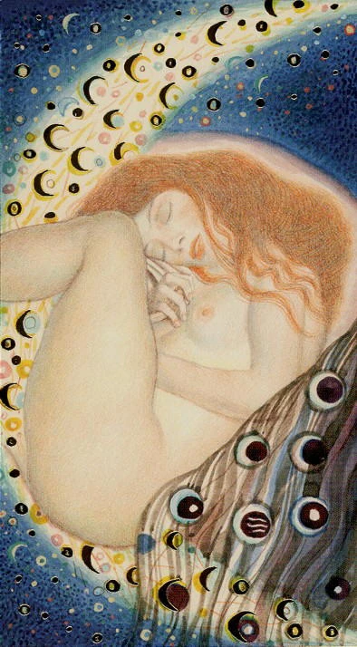
The Moon: rest inside a field of changing phases
A pale, curled figure sleeps across the lower half of the card, red hair flowing around the face and hands. Above, a blue field is crowded with crescents, circles and luminous yellow-white swirls; below, darker wave-like bands carry eye-shaped circles and moon forms.
The image makes uncertainty feel inward and bodily rather than threatening from a distance. Upright, The Moon can ask for rest, dream attention and tolerance for incomplete information. In shadow, withdrawal may become avoidance. In an actual reading, ask what the nervous system already knows before demanding a tidy explanation.
Relationships, creativity and material questions
Klimt Tarot is naturally eloquent in relationship readings because closeness, gaze and bodily distance are central to the art. It can distinguish tenderness from projection and attraction from genuine compatibility without reducing either to a yes-or-no verdict.
Its Wands speak well to creative momentum and visibility. Pentacles highlight value, craft, status and what is materially sustainable. For career questions, ask not only Will this succeed? but also What kind of success am I dressing for?
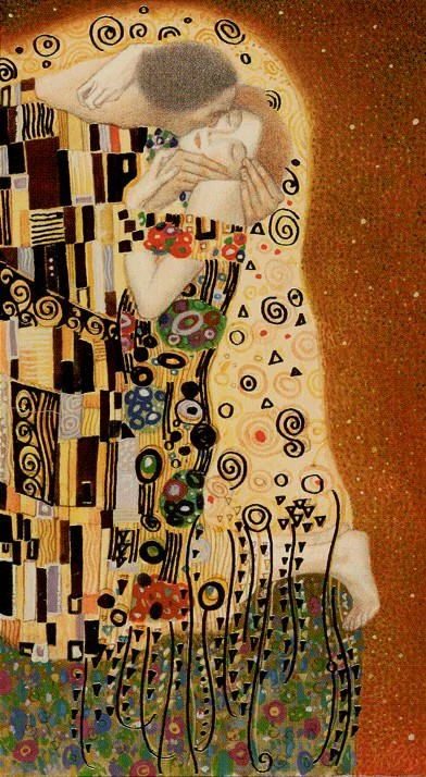
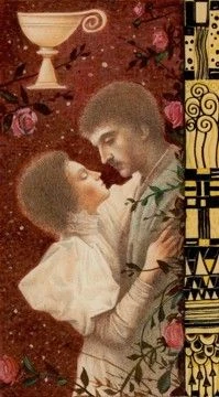
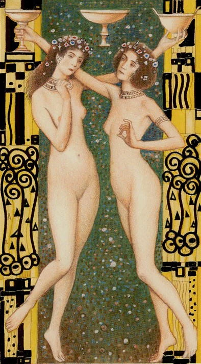
Desire, intimacy and shared feeling
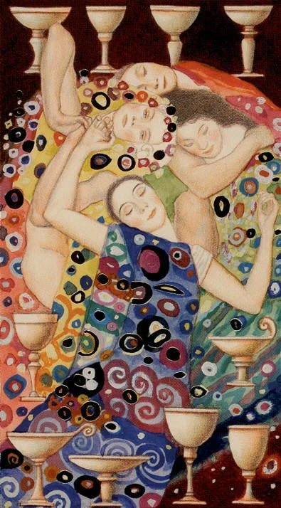
The Lovers, Ace of Cups, Three of Cups and Ten of Cups move from private embrace to emotional offering, companionship and collective ease. Across the four, closeness is shown through touch, mirrored bodies and cup forms surrounding the figures.
A. A. Atanassov’s art and the Klimt influence
The deck’s Klimt influence is clearest in flattened perspective, patterned garments, rectangular gold fields, spiral ornament and the tension between realistically modelled faces and highly decorative surroundings. Atanassov recombines those signals into tarot scenes rather than simply placing card titles under famous paintings.
That approach gives the minors enough personality to support intuitive reading, while repeated visual motifs help the deck feel coherent across suits. The trade-off is that some cards require slower looking: symbol density can hide the practical message if you rush.
Nine of Pentacles: composure, privacy and earned space
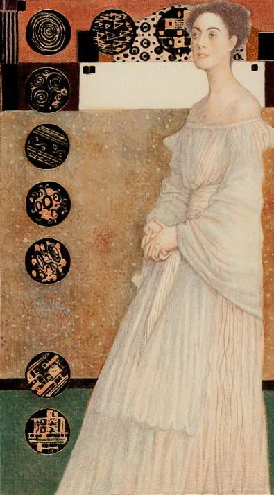
A woman in a long pale dress stands in profile with her hands folded at her waist. The background is divided into quiet blocks of tan, white, green and rust, while nine dark circular emblems descend in a measured line beside her. Her restrained posture contrasts with the strong graphic geometry around her.
This Nine of Pentacles presents independence as calm possession of one’s space rather than spectacle. Upright, it can describe self-command, privacy and the results of patient work. In shadow, composure may become isolation or an image maintained for others. Ask whether solitude is nourishing the self or protecting a performance.
Who will connect with this deck?
Art-deck collectors, visually intuitive readers, Klimt admirers and anyone who reads frequently about relationships or creative identity are likely to connect with it. It also suits readers who enjoy noticing colour, posture and texture as carefully as traditional symbols.
Readers who want highly literal Rider–Waite–Smith scenes, minimal ornament or instant one-keyword answers may find it demanding. The imagery can also include artistic nudity, so consider the reading setting and the comfort of the people involved.
Creative momentum in four stages
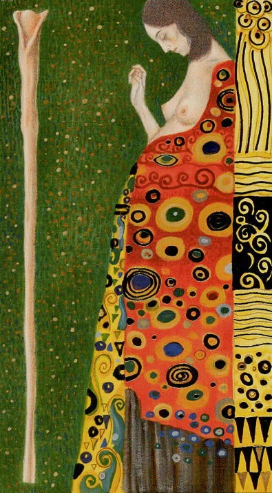
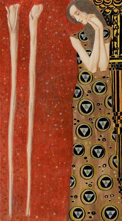
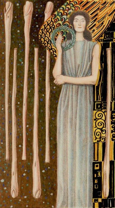
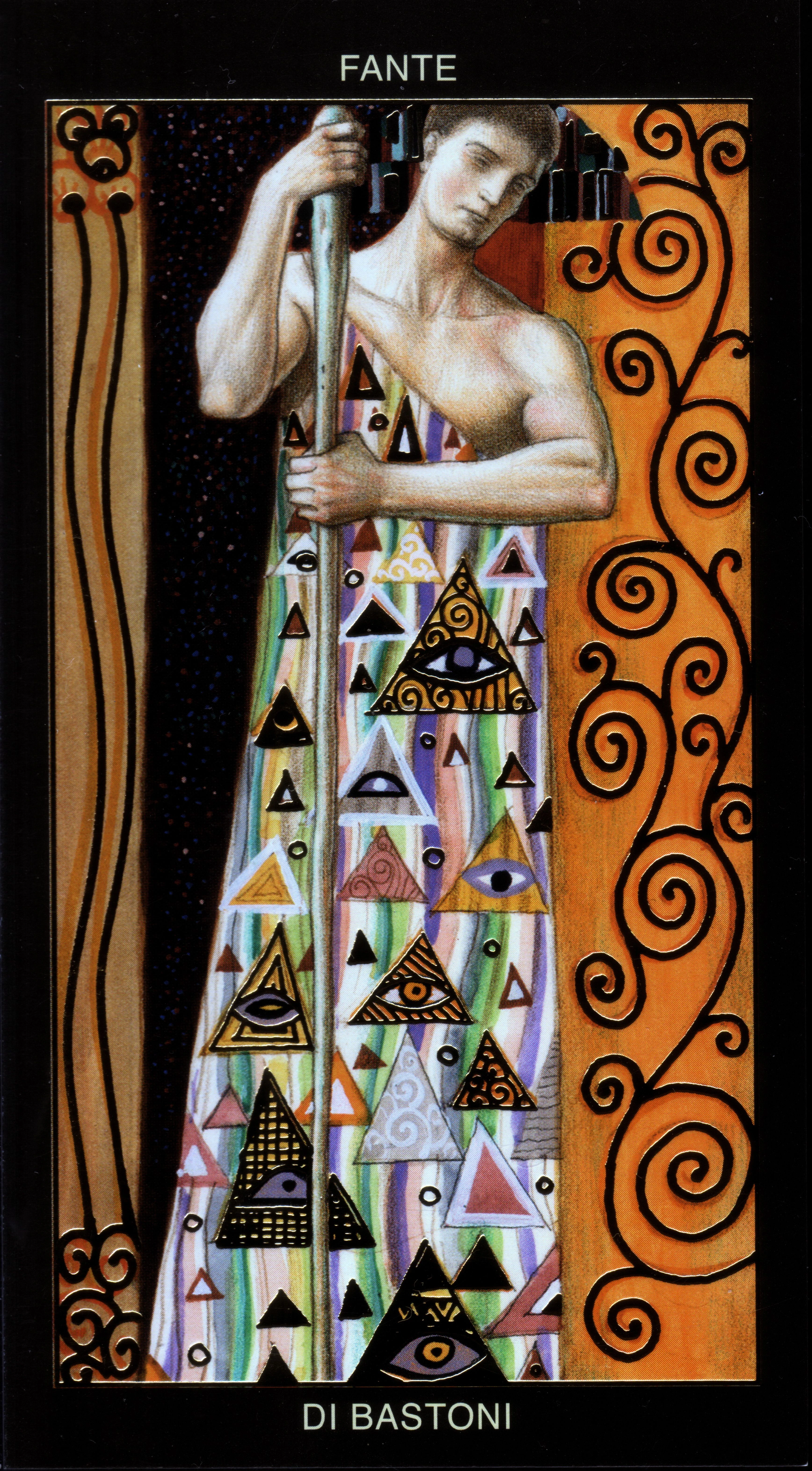
Ace, Two, Six and Page of Wands show inspiration moving from first spark to choice, visibility and apprenticeship. Vertical staffs repeat across changing fields of green, red, gold and black, while the human figure becomes progressively more involved.
Buying and edition guidance
The standard Lo Scarabeo edition contains 78 cards measuring 66 × 120 mm, with gold-foil impressions and compact multilingual instructions. The Mini Golden edition also contains 78 cards but measures 44 × 80 mm. Deluxe, boxed-set and localized editions circulate too, so compare the publisher, product title, dimensions, language and included materials before buying.
For second-hand copies, confirm that all 78 cards are present and ask for photographs of the box, backs and guide material. The reflective foil is more apparent in person than in digital previews, and decorative gold surfaces can show edge wear, so condition matters.
Read the distance before the decoration
Before interpreting a Klimt Tarot card, ignore the gold for a moment. Notice who is touching, turning away, enclosed, exposed or watching. Then bring the pattern back in and ask what it beautifies, protects or conceals. That sequence turns ornament into evidence.
Final Thoughts
Klimt Tarot is more than a gold-toned collector piece. Atanassov gives it a consistent emotional grammar of intimacy, display and patterned power, making it especially useful when the question involves desire, identity, creative ambition or value.
It asks for slower observation than a straightforward teaching deck, but that is also its reward. When read patiently, the images can separate what looks beautiful from what actually feels true.

Klimt Tarot FAQ
Who created Klimt Tarot?
A. A. Atanassov created the deck artwork, drawing on Gustav Klimt’s gold-rich decorative language. Lo Scarabeo published the deck.
How many cards are in the complete Klimt Tarot deck?
The complete printed deck contains 78 cards: 22 Major Arcana and 56 Minor Arcana.
Does Klimt Tarot follow traditional tarot meanings?
It keeps the familiar Major Arcana, four suits and court structure, but its collage-like scenes and Klimt-inspired figures may not reproduce every Rider–Waite–Smith cue literally.
Is Klimt Tarot beginner-friendly?
A beginner who already has a meanings reference can use it, but the ornamental compositions and less literal scenes make it more intuitive than a conventional teaching deck.
Are the Klimt Tarot cards really gilded?
Lo Scarabeo describes the standard and Mini editions as having gold-foil impressions. The reflective effect is more apparent on the physical cards than in flat screen images.
Why are some cards absent from the TarotFans Gallery?
TarotFans publishes only the clearly verified, usable card fronts recovered for this page. Thumbnail-only and uncertain source records are omitted rather than enlarged or mislabeled.


